

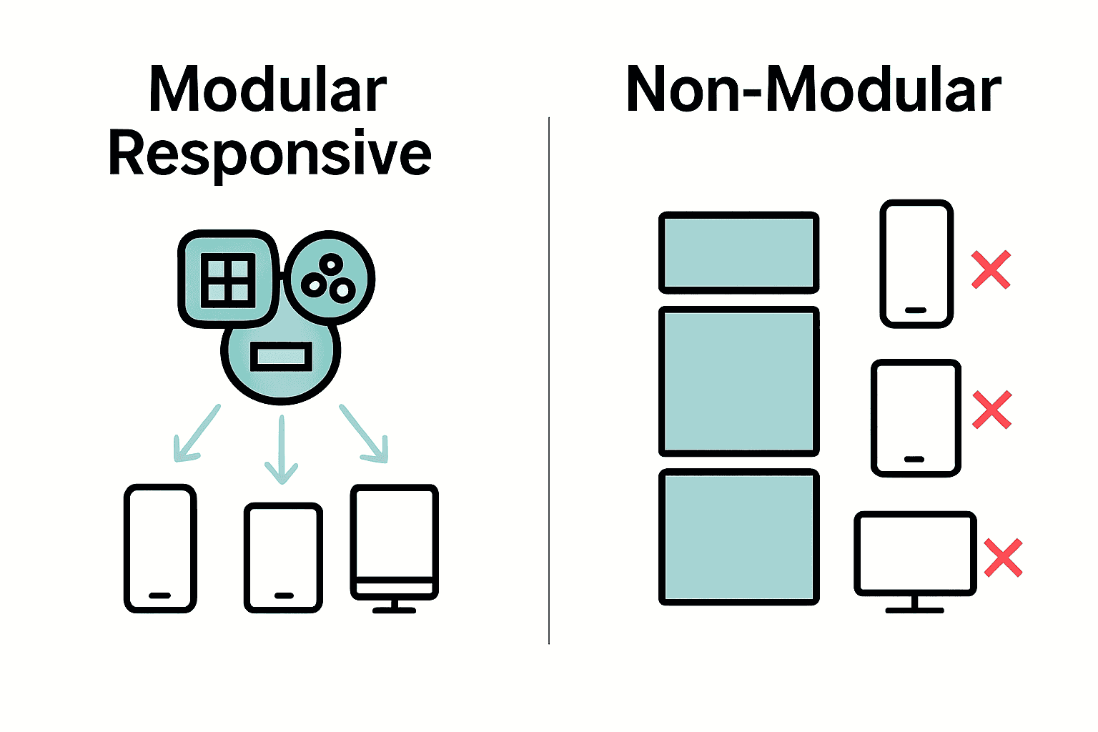
Nearly 60 percent of web traffic now comes from mobile devices, making responsive design more important than ever. A flexible design system not only helps your website look great on any screen, it also leads to smoother development and easier updates. By mastering a modular approach and focusing on adaptability, you set the stage for a web experience that feels effortless on phones, tablets, and desktops alike.
Table of Contents
- Step 1: Set Up A Flexible Design System
- Step 2: Implement Mobile-First Layouts
- Step 3: Integrate Scalable UI Components
- Step 4: Test Across Devices And Browsers
- Step 5: Optimize And Maintain Responsiveness
Quick Summary
| Key Point | Explanation |
|---|---|
| 1. Establish a flexible design system | Create a responsive grid layout using frameworks to ensure components adapt seamlessly to various devices. |
| 2. Prioritize mobile-first design | Design for smaller screens first to ensure essential content is highlighted, optimizing the user experience. |
| 3. Create reusable UI components | Build a library of customizable components that adapt effectively, maintaining visual and contextual consistency. |
| 4. Test across devices and browsers | Implement a comprehensive testing strategy to ensure your design functions well on all platforms and screen sizes. |
| 5. Optimize for performance and adaptability | Regularly review and refine your design for responsiveness and performance, ensuring it adjusts to evolving requirements. |
Step 1: Set Up a Flexible Design System
You are about to create a responsive design system that adapts seamlessly across different screen sizes and devices. This approach will help you build more modular and adaptable web interfaces.
Starting with a flexible design system requires understanding how responsive modules work. According to research from the paper on Modular Responsive Web Design, modern web applications benefit from modules that can adapt based on their local context. This means your design components should be smart enough to resize and restructure themselves dynamically.
Begin by establishing a responsive grid foundation. Using a framework like Foundation, you can quickly set up a responsive layout infrastructure that automatically adjusts to different screen dimensions. Your grid will serve as the skeleton for all design components, ensuring consistent spacing and alignment.
Next, create a set of reusable design tokens that define your system parameters. These tokens should include:
Here’s an overview of essential design tokens for a responsive system:
| Token Type | Example Values | Purpose |
|---|---|---|
| Color Palette | Primary Secondary Accent |
Maintain visual consistency |
| Typography Scales | Headings Body Captions |
Set readable, scalable fonts |
| Spacing Increments | 4px 8px 16px |
Control layout and padding |
| Breakpoints | 480px 768px 1024px 1280px |
Define device adaptability |
- Color palette
- Typography scales
- Spacing increments
- Breakpoint definitions
By standardizing these elements, you create a consistent language for your entire design system. Each component can reference these tokens, making updates and maintenance dramatically simpler.
Pro Tip: Document your design tokens in a centralized style guide to ensure team wide understanding and consistent implementation.
As you develop your system, focus on modularity and context awareness. Your goal is to build components that can gracefully adapt without requiring manual intervention for every screen size.
The next step will involve translating these design principles into actual code implementation, where you will bring your flexible design system to life.
Step 2: Implement Mobile-First Layouts
You are about to transform your web design approach by prioritizing mobile experiences from the ground up. This strategy will help you create more intuitive and efficient responsive interfaces.
According to research from ‘The Responsive Web’ course material, mobile first design is not just a trend but a fundamental approach to modern web development. As noted in Chapter 2, designing for smaller screens first ensures critical content gets immediate attention and creates a more streamlined user experience.
Start by sketching your layout on the smallest screen size possible. This means beginning with a smartphone width around 320 pixels. Your goal is to determine the most essential elements that must appear on mobile devices. What content truly matters? What actions are most critical for your users?
Define your core layout using flexible grid systems that scale smoothly. Use percentage based widths instead of fixed pixel measurements. This allows your design to adapt naturally across different device sizes. CSS Flexbox and CSS Grid become your primary tools for creating these responsive structures.
Consider these mobile first design principles:
- Prioritize content hierarchy
- Minimize unnecessary elements
- Optimize touch targets for finger interactions
- Use readable font sizes
- Ensure intuitive navigation
Pro Tip: Always test your layouts on actual mobile devices to validate your design decisions and user experience.
As you expand your layout to larger screens, you will use media queries to progressively enhance the design. This means adding complexity and additional elements only when more screen real estate becomes available.
The next phase involves implementing responsive typography and refining your layout across different device breakpoints.
Step 3: Integrate Scalable UI Components
You are about to build a robust design system with UI components that can adapt and scale across different devices and user contexts. This step will transform how you think about creating reusable interface elements.
According to research on the SAM framework, modern web development demands UI components that can self-adapt to various user interactions and screen environments. This means creating modular elements that are not just visually consistent but also contextually intelligent.
Begin by establishing a component library with a utility first approach. Tailwind CSS offers an excellent framework for creating flexible UI components without predefined rigid styles. Think of your components as building blocks that can be easily assembled and reassembled.
Design each component with three key principles:
- Modularity
- Responsiveness
- Customizability
Start by creating base components like buttons, form inputs, and card layouts. Ensure these components have clear prop definitions that allow easy customization. For instance, a button component should accept variations in size, color, and state without requiring complete redesign.
Pro Tip: Use design tokens to maintain consistency across your component library. This means creating standardized variables for colors, spacing, and typography.
Implement a systematic approach to component creation. Each component should have multiple variants that can adapt to different screen sizes and interaction modes. This might mean designing mobile touch friendly versions alongside desktop variants.
As you build your component library, focus on creating a cohesive visual language that can scale across your entire application. Your goal is to create UI elements that feel both familiar and flexible.
The next phase will involve testing and refining these scalable UI components to ensure they perform seamlessly across different devices and user scenarios.
Step 4: Test Across Devices and Browsers
You are about to embark on the critical mission of ensuring your responsive design works flawlessly across multiple devices and browsers. This step will help you create a truly universal web experience that performs consistently everywhere.
Research from the Galen Framework highlights the importance of comprehensive visual testing for responsive websites. Like solving a complex puzzle, you will verify that every design element looks and functions perfectly across different screen sizes and browser environments.
Begin by creating a comprehensive testing strategy that covers multiple dimensions. Your testing matrix should include:
- Different mobile devices (iOS and Android)
- Tablet screen sizes
- Desktop browsers (Chrome, Firefox, Safari, Edge)
- Various screen resolutions
Utilize browser developer tools to simulate different device viewports. These built in tools allow you to quickly check how your design responds without needing physical devices. However physical device testing remains crucial for capturing real world nuances.
According to research from the Cicero paper, developing a declarative approach to responsive testing can significantly improve your validation process. This means creating systematic rules that define acceptable visual and functional states across different contexts.
Pro Tip: Invest in cloud based testing platforms that provide access to hundreds of real devices and browser combinations. This will dramatically expand your testing capabilities.
Pay special attention to touch interactions, screen rotation, and performance metrics. A responsive design is not just about looking good but also about providing smooth user experiences across all platforms.
Automated testing tools can help streamline this process. Look for solutions that can capture screenshots and compare visual differences across different environments.
The next phase will involve refining your design based on testing insights and preparing for final implementation.
Step 5: Optimize and Maintain Responsiveness
You are about to learn the art of keeping your responsive design flexible, performant, and adaptable across ever changing digital landscapes. This final step will transform your approach to maintaining responsive web interfaces.
According to research on Flexbox, modern CSS layout models provide powerful tools for creating responsive designs that automatically adjust to different viewport sizes. Think of Flexbox as your responsive design Swiss Army knife that allows elements to intelligently reflow and resize.
Leverage CSS Grid Layout to create robust and flexible grid systems. This powerful CSS module enables you to design complex layouts that gracefully adapt to different screen dimensions without writing extensive media queries.
Implement these optimization strategies:
- Use relative units like percentages and viewport units
- Minimize unnecessary media queries- Leverage browser caching
- Optimize image sizes and formats
- Implement lazy loading for images and components
Pro Tip: Regularly audit your responsive design using browser developer tools to identify performance bottlenecks and visual inconsistencies.
Establish a systematic approach to performance monitoring. This means setting up performance budgets that track metrics like load time, resource consumption, and rendering speed across different devices.
Consider using performance monitoring guides to help you track and improve your responsive design implementation.
The key is creating a living design system that evolves with technological changes and user expectations. Your responsive design should feel like a flexible organism that adapts seamlessly to different environments.
Elevate Your Responsive Design Workflow Today
Struggling to build flexible, scalable web interfaces that perform flawlessly across all devices is a common challenge for modern web teams. From mastering modular UI components to implementing mobile-first layouts and ensuring seamless cross-device testing the complexity can feel overwhelming. You need a partner who understands the importance of standardized design tokens, context-aware components, and performance optimization to make your vision a reality.

At Markupus, we specialize in web development and design tailored for the e-commerce niche using ReactJS and NextJs combined with cutting-edge AI technologies like Open AI and Claude. Our expertise in creating responsive, adaptable solutions powered by smart automations and scalable UI components can streamline your workflow and bring your flexible design system to life. Don’t wait to transform your responsive web projects into effortless experiences — explore how we can help you at Markupus and take the first step toward mastering responsive design with confidence.
Frequently Asked Questions
How can I set up a flexible design system for responsive web design?
To set up a flexible design system, begin by establishing a responsive grid foundation and creating reusable design tokens. Utilize a framework to lay out your grid, and define essential tokens for color, typography, spacing, and breakpoints to ensure consistency across your design.
What are mobile-first layouts, and how do I implement them?
Mobile-first layouts focus on designing the smallest screen sizes first, ensuring critical content is prioritized. Start by sketching your layout for a smartphone width of around 320 pixels and gradually enhance it for larger screens using flexible grid systems and media queries.
How do I create scalable UI components that work across different devices?
To create scalable UI components, focus on modularity, responsiveness, and customizability while establishing a component library. Design base components with clear prop definitions to allow easy customization based on the context, ensuring they adapt well to diverse screen sizes and interaction modes.
What testing strategies should I use for responsive design across devices?
Develop a comprehensive testing strategy that includes various mobile devices, tablet sizes, and desktop browsers. Use browser developer tools for quick simulations, but also conduct physical device testing to capture real-world nuances and ensure a consistent user experience.
How can I optimize and maintain the responsiveness of my design?
Optimize your responsive design by using relative units and CSS layout models like Flexbox and CSS Grid. Regularly audit your design to identify performance bottlenecks and set performance budgets to track metrics like load time and rendering speed, aiming for improvements within 30 days.


