
More than 90 percent of users abandon sites with poor experience or slow loading times. Today, building a web project that attracts and retains visitors means more than just good looks. It requires clear planning, smart technology choices, and an obsession with usability. You will learn how strategic decisions at every stage can help you create web applications that delight users, stay competitive, and scale with your business goals.
Quick Summary
| Key Point | Explanation |
|---|---|
| 1. Define user needs comprehensively | Gather insights through stakeholder interviews to understand genuine user pain points and expectations for a better web experience. |
| 2. Document a clear project scope | Create a project scope document that outlines objectives, constraints, timelines, and key performance indicators to ensure alignment among stakeholders. |
| 3. Choose technology stack wisely | Select a technology stack that supports your project requirements and scalability, emphasizing community support and integration with existing tools. |
| 4. Implement responsive design principles | Adopt a mobile-first design approach utilizing flexible layouts and accessibility features to provide optimal user experiences across various devices. |
| 5. Conduct rigorous usability testing | Engage real users for testing across devices to identify issues and improve usability, utilizing both automated and manual testing strategies for thorough validation. |
Table of Contents
- Step 1: Define Project Scope And User Needs
- Step 2: Select Technology Stack And Tools
- Step 3: Design Responsive User Interfaces
- Step 4: Develop Optimized And Scalable Pages
- Step 5: Integrate Ai And Automation Features
- Step 6: Test Usability And Ensure Quality
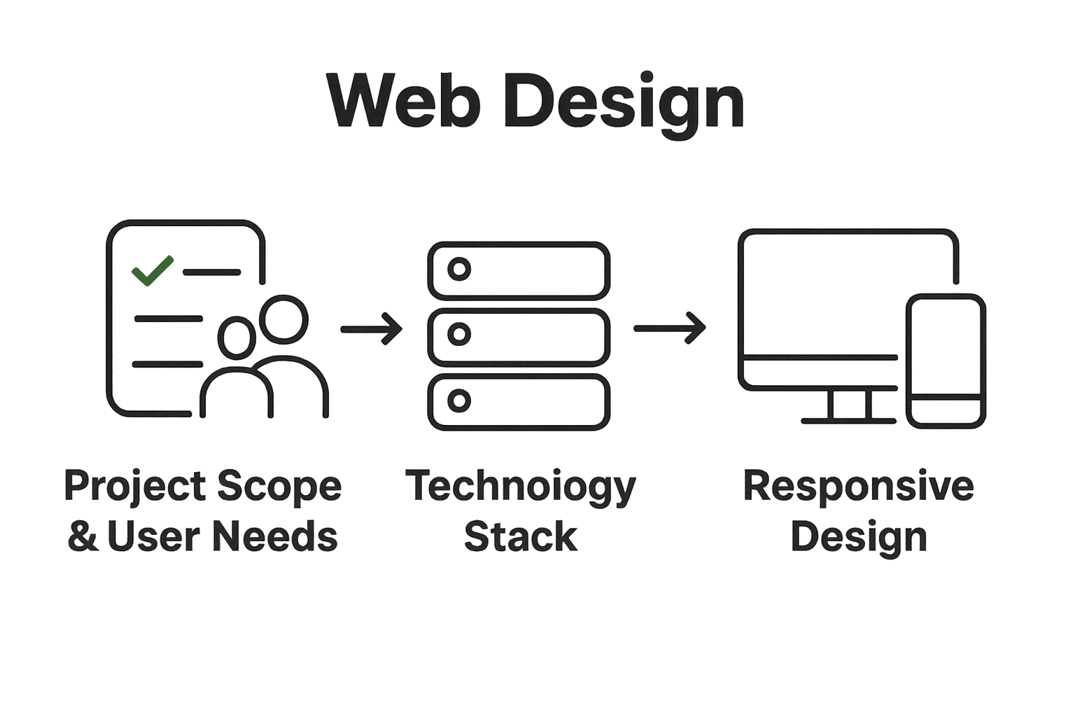
Step 1: Define project scope and user needs
In this critical first step, you will map out the strategic blueprint for your web design project by understanding exactly what your users need and defining clear boundaries for your work. Think of this phase as creating a detailed roadmap before starting an exciting journey.
Start by gathering comprehensive insights about your target audience. According to the University of Michigan’s design system, design efforts must be grounded in real user research and evidence. This means going beyond assumptions and diving deep into understanding actual human needs.
Begin with stakeholder interviews and user research sessions. Ask open ended questions that reveal genuine pain points, preferences, and expectations. What problems are they trying to solve? What frustrates them about current web experiences? Document everything meticulously.
Pro Tip: Record and transcribe your user interviews to capture nuanced details you might miss during live conversations.
As Stanford d.school’s Scopey project recommends, use generative questioning to clarify strategic goals. Break down your research into key categories: who are the users, what are their core objectives, what technical and emotional constraints might exist?
Create detailed user personas that represent different audience segments. These personas will serve as your North Star throughout the design process. Include demographic information, behavioral patterns, technology comfort levels, and specific web interaction preferences.
Next, draft a clear project scope document that outlines:
Here’s a summary of key elements to include in your project scope document:
| Element | Description | Example |
|---|---|---|
| Design Objectives | Clear, measurable design outcomes | Modern UI, improved conversions |
| User Experience Goals | Targeted user needs and journeys | Intuitive navigation, fast access |
| Technical Requirements | Required tech, platforms, or frameworks | ReactJS, API integration |
| Constraints | Known limitations or challenges | Budget, timeline, compliance |
| Timelines | Estimated delivery dates or milestones | MVP in 8 weeks |
| Key Performance Indicators | Metrics to track success | Bounce rate, task completion rate |
| • Specific design objectives | ||
| • User experience goals | ||
| • Technical requirements | ||
| • Potential constraints or limitations | ||
| • Estimated timelines | ||
| • Key performance indicators |
By thoroughly defining your project scope upfront, you prevent scope creep and ensure everyone involved understands the project’s boundaries and expectations. This foundational work sets the stage for a focused, user centered web design strategy.
With your research completed and scope documented, you are now ready to move into the wireframing and initial design conceptualization phase where these insights will directly inform your creative decisions.
Step 2: Select technology stack and tools
In this pivotal stage, you will strategically choose the technological foundation that will power your web design project. Your goal is to select tools and frameworks that align perfectly with your project requirements and provide scalability for future growth.
Start by reflecting on the user research and project scope you defined earlier. Your technology stack should directly support the functionality and experience you want to deliver. Since your current website focuses on n8n automations and AI agents using ReactJS and NextJS, you have a strong starting point.
Consider the core requirements for modern web development. For frontend technologies, look at frameworks that offer robust performance and flexibility. ReactJS and NextJS remain excellent choices for building interactive and fast web applications. They provide component based architecture that makes development efficient and maintainable.
Pro Tip: Always evaluate technology choices based on community support learning resources and long term sustainability.
For backend development, explore technologies that integrate seamlessly with your frontend stack. If you are using AI and automation tools like n8n consider serverless architectures or microservices that can scale dynamically.
Evaluate your database needs carefully. Will you require real time data processing? Are you dealing with complex data relationships? Choose between SQL and NoSQL databases based on your specific project requirements.
Key considerations for your technology stack selection include:
• Performance capabilities
• Scalability potential
• Developer ecosystem and community support
• Integration capabilities
• Security features
• Cost effectiveness
Dont get caught up in chasing the latest trendy technology. Select tools that solve your specific business problems and provide a smooth development experience. Your technology stack is a strategic investment that should grow with your business.
With your technology stack defined, you are now prepared to move into the architectural design phase where you will create a detailed technical blueprint for your web project.
Step 3: Design responsive user interfaces
In this crucial stage, you will craft a user interface that looks stunning and functions flawlessly across every device screen from mobile phones to large desktop monitors. Your goal is to create a flexible design that adapts seamlessly to different screen sizes and user interaction methods.
According to the University of Texas Medical Branch web planning guidance, responsive design goes far beyond visual flexibility. It requires deep attention to accessibility and semantic structure. This means using HTML5 techniques that make your interface not just visually appealing but truly usable for all users.
Start by implementing a mobile first approach. Design your core layout and functionality for smaller screens initially, then progressively enhance the experience for larger displays. This strategy ensures that your fundamental user experience remains consistent regardless of device type.
Pro Tip: Use CSS media queries and flexible grid systems to create layouts that automatically adjust to different screen dimensions.
Adaptive web design techniques complement responsive approaches by serving optimized content versions based on specific device characteristics. As research from Wikipedia indicates, this method allows for more targeted presentation strategies that can significantly improve usability.
Ensure your interface includes:
• Touch friendly interaction elements
• Legible typography that scales appropriately
• Intuitive navigation that works across devices
• Fast loading images and graphics
• Consistent color schemes and branding
Pay special attention to accessibility. Implement keyboard navigation support screen reader compatibility and maintain proper color contrast ratios. These considerations make your interface welcoming to users with diverse abilities and technological constraints.
Explore our responsive design case studies to see real world examples of adaptive interfaces that successfully balance aesthetics and functionality.
With your responsive design framework established you are now prepared to move into the detailed interaction and visual design phase where you will refine the user experience and visual language of your web project.
Step 4: Develop optimized and scalable pages
In this critical development phase, you will transform your responsive design blueprint into performant web pages that can handle growing user demands and deliver lightning fast experiences. Your mission is to create a technical foundation that supports seamless user interactions while maintaining exceptional speed and reliability.
Building on your previous responsive design work, focus on creating modular code structures that allow easy expansion and maintenance. Since your technology stack uses ReactJS and NextJS you have powerful tools for creating component based architectures that naturally support scalability.
Implement code splitting and lazy loading techniques to ensure your web pages load quickly. This means loading only the essential JavaScript and resources needed for initial page render while deferring additional components until they are actually required. Modern frontend frameworks like NextJS provide built in optimization features that make this process straightforward.
Pro Tip: Use performance monitoring tools to continuously track your page load times and identify potential bottlenecks before they impact user experience.
Consider implementing server side rendering for critical content paths. This approach improves initial page load speeds and provides better SEO performance. NextJS excels at generating static and server rendered pages that can dramatically reduce time to first meaningful paint.
Key optimization strategies include:
• Minimizing external script dependencies
• Compressing and optimizing image assets
• Implementing efficient caching mechanisms
• Reducing unnecessary DOM manipulations
• Using efficient state management techniques
Learn from our performance optimization case studies to understand real world strategies for building high performance web applications.
Prioritize writing clean modular code that follows best practices. Use TypeScript for enhanced type safety and consider implementing design patterns that promote code reusability and maintainability.
With your optimized and scalable pages developed you are now ready to move into comprehensive testing and refinement stages where you will validate performance and user experience across different environments and devices.
Step 5: Integrate AI and automation features
In this transformative stage, you will elevate your web application by embedding intelligent automation and AI capabilities that dramatically enhance user experience and operational efficiency. Your objective is to create smart interactive features that anticipate user needs and streamline complex workflows.
As research from Wikipedia highlights, agentic AI represents a groundbreaking approach where artificial intelligence can autonomously perform web interactions and task management. This means your website can potentially offer intelligent assistance that goes beyond traditional static interfaces.
Start by identifying specific areas where AI can add genuine value. For your n8n automation focused platform, consider implementing AI agents that can help users configure complex workflows, suggest optimization strategies, or provide real time guidance through intricate automation setups.
Pro Tip: Focus on solving actual user problems with AI rather than adding features just for technological novelty.
Leveraging tools like OpenAI and Claude, you can create conversational interfaces that understand context and provide intelligent responses. Implement natural language processing capabilities that allow users to interact with your platform through intuitive conversational flows.
Consider integrating AI powered features such as:
• Intelligent workflow recommendation engines
• Automated configuration assistants
• Predictive performance optimization suggestions
• Contextual help and documentation generators
• Real time error detection and troubleshooting
Drawing inspiration from Figma’s AI integration strategies, look for opportunities to create seamless UI to code workflows. AI can help generate code snippets, suggest design improvements, and even automate repetitive development tasks.
Explore our AI integration case studies to understand practical implementation strategies for intelligent web applications.
Remember that successful AI integration is about creating a supportive ecosystem that feels natural and enhances user capabilities rather than replacing human decision making.
With your AI and automation features strategically integrated, you are now prepared to move into the final refinement and testing stages where you will validate the intelligence and reliability of your new technological capabilities.
Step 6: Test usability and ensure quality
In this critical validation phase, you will rigorously examine your web application to confirm it delivers an exceptional user experience across different devices and scenarios. Your mission is to uncover potential issues identify improvement opportunities and guarantee a smooth seamless interaction for every user.
Recent research from advanced testing methodologies reveals exciting opportunities for comprehensive quality assurance. According to emerging studies in autonomous testing approaches multi agent collaboration and reinforcement learning techniques can dramatically enhance traditional testing frameworks.
Begin with comprehensive manual testing across multiple devices and browsers. Simulate real world user scenarios by creating detailed user journey maps that cover every possible interaction path. Pay special attention to edge cases and unexpected user behaviors that automated systems might miss.
Pro Tip: Recruit actual users from your target audience to perform unmoderated testing and provide genuine feedback about their experience.
Leverage advanced testing techniques like behavior driven development frameworks. These methodologies allow you to dynamically generate test scenarios that go beyond traditional linear testing approaches. By using autonomous agents you can uncover subtle usability issues that conventional testing might overlook.
Focus your testing efforts on key performance indicators:
• Page load and response times
• Accessibility compliance
• Cross device functionality
• User interaction smoothness
• Error handling and recovery
Implement both automated and manual testing strategies. Automated tests provide consistent reproducible results while manual testing brings nuanced human perspective. Tools like Selenium Cypress and modern AI powered testing platforms can help streamline this process.
Discover our comprehensive testing methodologies to understand how professional teams ensure exceptional web application quality.
Remember that testing is an iterative process. Treat each test cycle as an opportunity to refine and improve your web application continuously.
With your thorough testing completed you are now prepared to launch your web project confidently knowing you have created a robust reliable and user friendly digital experience.
Ready to Turn Modern Web Challenges into Your Business Advantage?
If you have ever struggled to clearly define your web project scope, select the right technologies, build responsive interfaces, or effectively integrate AI and automation, you are not alone. Many growing businesses find these steps overwhelming, especially when trying to scale efficiently and maintain high quality user experiences. The article showed just how easy it is to lose track of user needs or get stuck choosing between tools and frameworks that might not fit your vision. At the same time, reliable performance and seamless AI integrations are not anymore just “nice to have” features—they are the backbone of modern e-commerce. Our specialized team at Markupus understands the frustration of scope creep, hidden technical debt, and the constant push to keep up with user expectations.
Take the next step toward a smooth, future-proof web presence. At Markupus, we focus on n8n automations, AI agent creation, and advanced web development using ReactJS and NextJS. See how strategic solutions in responsive design and AI integration can transform your challenges into growth opportunities. Get in touch now to make your business site faster, smarter, and ready for the next chapter.
Frequently Asked Questions
What are the key steps in modern web design for reliable business sites?
The key steps in modern web design include defining project scope and user needs, selecting the technology stack, designing responsive user interfaces, developing optimized pages, integrating AI and automation features, and testing for usability and quality. Follow a structured approach by dedicating specific timeframes to each step, typically ranging from a few weeks to several months, depending on project complexity.
How can I effectively gather user needs for my web design project?
To effectively gather user needs, conduct stakeholder interviews and user research sessions focused on open-ended questions. Document insights meticulously to identify pain points and preferences, compiling these insights into detailed user personas that will guide your design decisions.
What factors should I consider when selecting my web development technology stack?
Consider performance capabilities, scalability potential, community support, integration needs, and security features when selecting your technology stack. Aim to align your choices with the specific functionality required for your project, ensuring tools enhance both development experience and future growth potential.
How do I ensure my web design is responsive across all devices?
To ensure your web design is responsive, implement a mobile-first approach that designs for smaller screens first and then scales up for larger displays using flexible grid systems. Additionally, utilize CSS media queries to create layouts that adjust automatically, guaranteeing a consistent user experience on all devices.
What are effective methods for testing usability in web design?
Effective methods for testing usability include conducting manual testing across multiple devices and user scenarios, as well as recruiting actual users to provide feedback. Prioritize key performance indicators like accessibility compliance and user interaction smoothness and iterate based on findings to refine the design continuously.
How can I integrate AI features into my web application?
To integrate AI features, identify specific areas that could benefit from automation, such as workflow recommendations or context-aware support. Implement natural language processing capabilities to facilitate user interactions, enhancing the overall experience while ensuring the AI solutions address real user needs.


