

Over 54 percent of web traffic now comes from mobile devices, yet many websites still fail to provide a seamless experience on every screen. If your site looks awkward or loads slowly on phones and tablets, you could be driving users away without realizing it. Understanding how responsive design works gives your SaaS website the power to reach customers wherever they are, keeping your content sharp and easy to use on any device.
Table of Contents
- Step 1: Set Up Essential Responsive Design Tools
- Step 2: Implement Fluid Grids And Flexible Layouts
- Step 3: Apply Scalable Typography And Media
- Step 4: Integrate Responsive Navigation Features
- Step 5: Test And Optimize Website Responsiveness
Quick Summary
| Key Point | Explanation |
|---|---|
| 1. Choose a responsive CSS framework | Select frameworks like Bootstrap or Foundation to streamline your development process for responsive web design. |
| 2. Implement fluid grids for layouts | Use percentage-based widths to ensure your web designs adapt seamlessly to various screen sizes instead of fixed measurements. |
| 3. Utilize scalable typography and media | Employ relative units and flexible media properties to ensure text and images dynamically adjust on different devices. |
| 4. Create adaptive navigation systems | Design navigation menus that transform based on device size, ensuring ease of use for all users. |
| 5. Test your website’s responsiveness | Regularly validate responsiveness using real devices and automated tools to maintain optimal performance across platforms. |
Step 1: Set Up Essential Responsive Design Tools
In this step, we will configure the fundamental tools needed to build responsive web designs for modern SaaS websites. You will learn how to select and integrate powerful front-end frameworks that streamline your development process.
The first critical tool to consider is a responsive CSS framework. According to Wikipedia, Bootstrap offers an exceptional free and open-source solution for mobile-first web development. It provides pre-built HTML, CSS, and JavaScript design templates that cover essential interface components like typography, forms, buttons, and navigation systems.
Another robust option is Foundation, which delivers a comprehensive responsive grid system with UI components and templates. When selecting your framework, evaluate your specific project requirements and team expertise.
Here’s a comparison of leading responsive CSS frameworks to help guide your selection:
| Framework | Grid System | Key Features | Ease of Use |
|---|---|---|---|
| Bootstrap | 12-column flexible | Pre-built UI Mobile-first approach Large community |
Very user-friendly |
| Foundation | 12-column flexible | Advanced customization Comprehensive UI kit Accessibility tools |
Moderate learning curve |
Pro Setup Tips
When integrating these frameworks, follow these strategic approaches:
- Download the official framework files directly from their websites
- Include both CSS and JavaScript libraries in your project
A quick warning: always check framework compatibility with your existing tech stack. Some frameworks work better with specific JavaScript libraries or development environments.
Learn more about modern web design steps with our tutorial on responsive design workflow.
Next, we will explore how to implement responsive grid systems and create flexible layouts that adapt seamlessly across different device sizes.
Step 2: Implement Fluid Grids and Flexible Layouts
In this section, you will learn how to create responsive web designs using advanced grid systems that adapt seamlessly across different screen sizes. We will explore techniques for building flexible layouts that maintain visual integrity and functionality on mobile, tablet, and desktop devices.
According to Wikipedia, CSS Grid Layout provides developers with a powerful module for creating complex responsive web design grid layouts more consistently across browsers. This modern approach allows you to define grid structures that automatically adjust to different screen dimensions.
To implement fluid grids, start by defining percentage-based column widths instead of fixed pixel measurements. For instance, instead of setting a column at 500 pixels, set it to 50% of the container width. This ensures that your layout remains proportional and adaptable.
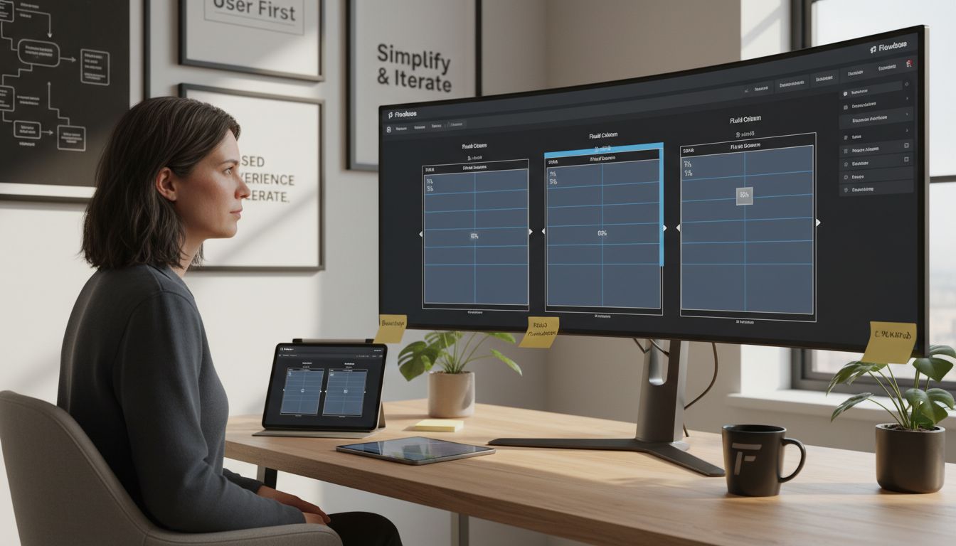
Most CSS frameworks include predefined grid systems with classes that simplify responsive design. Bootstrap and Foundation offer 12-column grid structures that you can easily customize to fit your specific design requirements.
Responsive Grid Best Practices
When creating fluid layouts, remember these key strategies:
- Use max-width and min-width properties to control element scaling
- Implement media queries to adjust layouts for different device breakpoints
- Prioritize content hierarchy and readability across screen sizes
Warning: Test your responsive grid extensively on multiple devices and browsers to ensure consistent performance.
Explore our modern website design tips for additional insights.
In the next section, we will dive deeper into advanced responsive design techniques and explore how to optimize performance across different device types.
Step 3: Apply Scalable Typography and Media
In this step, you will learn how to create responsive typography and media elements that look stunning across all device sizes. We will explore techniques to make your text and images adapt seamlessly to different screen dimensions.
According to innovative research, variable fonts represent a breakthrough in typographic technology. These fonts allow multiple typeface variations to be contained within a single file, enabling more flexible and responsive typography that can dynamically adjust to different screen sizes.
To implement scalable typography, start by using relative units like viewport width (vw) or em instead of fixed pixel sizes. This approach ensures that your text scales proportionally across different devices. For example, setting font sizes to 2vw means the text will automatically resize based on the viewport width.
Media elements require special attention. Flexible images can be achieved using CSS techniques like setting ‘max-width: 100%’ to ensure images scale appropriately within their container without losing quality or breaking the layout.
Responsive Typography Strategies
When working with scalable typography and media, consider these key approaches:
- Use CSS media queries to adjust font sizes at different breakpoints
- Implement responsive image techniques that preserve aspect ratios
- Choose fonts that remain legible at multiple sizes
Warning: Always test your typography and media elements on various devices to ensure consistent readability and visual appeal.
Learn more about modern web design approaches in our comprehensive tutorial.
In the next section, we will explore advanced techniques for optimizing performance and user experience across different devices.
Step 4: Integrate Responsive Navigation Features
In this section, you will learn how to create adaptive navigation systems that provide seamless user experiences across mobile, tablet, and desktop devices. We will explore techniques for building flexible menus that transform intuitively based on screen size.
Research reveals fascinating approaches to responsive navigation. According to an academic study, SAM represents a modular JavaScript framework for self-adapting menus, offering sophisticated control over menu adaptation styles and target policies. This innovative approach allows developers to create truly dynamic navigation experiences.
To implement responsive navigation, start by designing a mobile-first menu structure. Consider using hamburger menus for smaller screens that expand into full horizontal navigation on larger displays. Prioritize critical navigation links and use dropdown or collapsible sections to manage complex menu hierarchies.
While developing your navigation, consider tools that provide flexibility. Readymag demonstrates how modern design platforms enable freeform positioning of elements without rigid constraints, which can inspire more creative navigation approaches.
Responsive Navigation Best Practices
When creating adaptive navigation systems, remember these key strategies:
- Use CSS media queries to control menu display and behavior
- Implement touch-friendly interaction elements for mobile devices
- Ensure navigation remains clear and accessible across all screen sizes
Warning: Always conduct thorough cross device testing to guarantee smooth navigation performance.
Explore our modern website design tips for additional navigation insights.
In the next section, we will dive deeper into performance optimization techniques for responsive web designs.
Step 5: Test and Optimize Website Responsiveness
In this crucial step, you will learn comprehensive strategies for testing and fine-tuning your responsive web design to ensure seamless performance across all devices. We will explore advanced techniques to validate and improve your website’s adaptability.
Advanced testing frameworks offer powerful solutions for responsive design validation. The Galen Framework, an open-source tool written in Java, provides comprehensive layout and functional testing capabilities specifically designed for verifying responsive website appearances across different screen sizes.
To effectively test responsiveness, utilize multiple approaches. Start by using browser developer tools to simulate various device sizes and screen resolutions. Create a systematic testing process that includes checking layout integrity, image scaling, navigation functionality, and text readability at different breakpoints.
Research reveals innovative approaches to adaptive interfaces. ORC Layout introduces a constraint-based graphical user interface methodology that supports adaptive GUI layouts, offering insights into dynamic design optimization.
Responsive Testing Best Practices
When optimizing website responsiveness, implement these critical strategies:
- Use multiple physical devices for real-world testing
- Leverage automated testing tools and browser emulators
- Check performance metrics like loading speed and interaction responsiveness
Warning: Performance can vary significantly between devices, so comprehensive testing is essential.
Discover our comprehensive website design checklist for SaaS success.
In our final section, we will explore advanced techniques for maintaining and updating responsive web designs to keep pace with evolving technology standards.
Master Responsive Web Design with Smart Automation and Modern Tech
Building a fluid and adaptive responsive design for your SaaS website can feel overwhelming when you are striving to integrate cutting-edge frameworks, scalable typography, and seamless navigation. You want your site to shine across all devices but often face challenges like complex grid systems, testing responsiveness, and maintaining performance. The tutorial provides essential insights into responsive CSS frameworks, fluid grids, and dynamic navigation but taking these concepts from theory to flawless execution calls for specialized expertise.

Leverage Markupus to transform your responsive design challenges into strengths. Our team excels at web development using ReactJS and NextJS combined with AI-powered automation to streamline tasks and create scalable, visually stunning e-commerce and SaaS websites. By automating workflows and integrating advanced techniques covered in the tutorial, we help you accelerate deployment while ensuring your site adapts perfectly to every screen. Discover how our solutions empower responsive design projects by visiting Markupus landing page and unlocking modern web development workflows today.
Frequently Asked Questions
How do I choose the right responsive CSS framework for my SaaS website?
Selecting a responsive CSS framework depends on your specific project needs and your team’s expertise. Evaluate options like Bootstrap for ease of use or Foundation for advanced customization and detailed UI components. Consider testing both frameworks in a small project to determine which one fits your workflow best.
What are fluid grids, and how can they improve my web design?
Fluid grids use percentage-based widths instead of fixed pixel sizes, allowing your website layout to adapt to different screen sizes. Implement fluid grids by defining your column widths in percentages to maintain proportionality across devices. Aim for a 12-column layout for simplicity and flexibility.
How can I implement responsive typography in my SaaS website?
To create responsive typography, use relative units such as viewport width (vw) or em for font sizes, allowing text to scale proportionally based on the viewing environment. By setting font sizes to a relative unit, you ensure that your text remains readable across devices. Test your typography design to optimize legibility on screens ranging from mobile to desktop.
What are the best practices for creating responsive navigation?
Creating responsive navigation involves designing a mobile-first menu and incorporating touch-friendly elements. Use CSS media queries to adapt the navigation layout based on screen size, ensuring clear and accessible links across devices. Consider employing dropdown menus to manage more complex navigation structures effectively.
How can I test the responsiveness of my website effectively?
Test your website’s responsiveness by using browser developer tools and multiple physical devices to simulate various screen sizes. Create a systematic testing approach that checks layout integrity, image scaling, and readability across different breakpoints. Aim to gather feedback and make adjustments within a week to enhance user experience.
What should I optimize for when ensuring my responsive design performs well?
Focus on loading speed and interaction responsiveness to maintain a smooth user experience across devices. Utilize performance metrics to identify any issues that could slow down your site. Regularly analyze your website’s performance and implement improvements, targeting a reduction in load times by ~20%.


